Small Change in Linking
I thought about this

Then I thought about it...

Then I thought about it some more...

Then it occurred to me that I'm doing the links wrong for this project!! The whole point of creating the Walls in the first place is for people to see them directly. For the links, I now have them pointing to the posts for the specific wall, so bloggers can see the wall, read the intro to your blog, and then enter right from the posting. I thought this seemed to make more sense for the type of interractive link exchanging that is happening.
Many thank's to those that have posted walls and commenting on the concept, but eventually those posts will go into archives on your blogs. I thought this would be a way to keep your art in the forefront. (let me know if I'm just having one of those 'brain-farts' again).
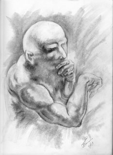
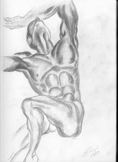
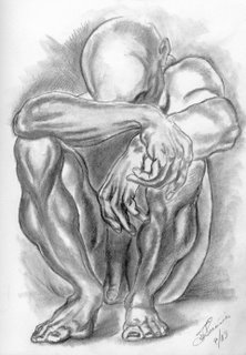
All the drawing on this post are drawn from exercises in
Burne Hogarth's, Dynamic Figure Drawing
All are 11x14 pecil on paper
Thanks
Foxxfyrre
Eventually, I'd like to create the link to your art as a thumbnail gallery, but I'm not quite sure how to procede with it on a Blog..Any Ideas?
Foxxfyrre
Eventually, I'd like to create the link to your art as a thumbnail gallery, but I'm not quite sure how to procede with it on a Blog..Any Ideas?
Comments
check out my blog for more details!
-Peanut-